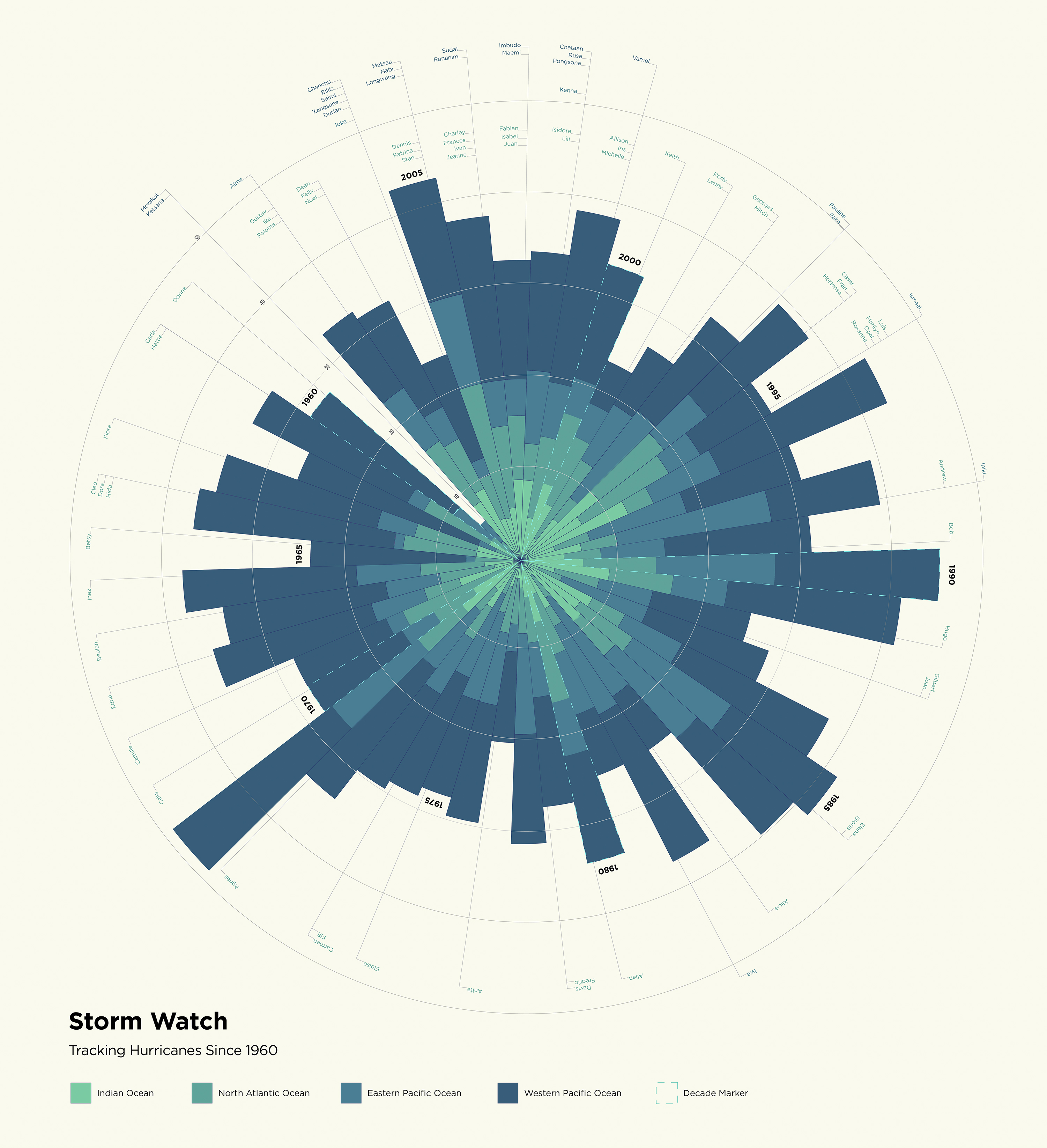
Storm Watch
Cincinnati | 2013Data Visualization
Using open source data, I curated hurricane statistics (1960–early 2009) necessary to compare storms across the world. The data included the number of hurricanes from each year, number of hurricanes in each ocean and the names retired from each ocean during each year. After gathering all of the information, I generated multiple equations to accurately represent all the data relative to each other.
The data is portrayed in a radial pattern to represent the “eye of the storm”, the center most point of a hurricane. All of the pie pieces are the same width with varied lengths for comparison, and within each pie piece, four (4) colors represent the different oceans. Data came from the Indian, North Atlantic, East Pacific and West Pacific. Around the outer edges of the circle, a viewer can find the specific hurricane names from each year.
Completed while a student at the University of Cincinnati.