
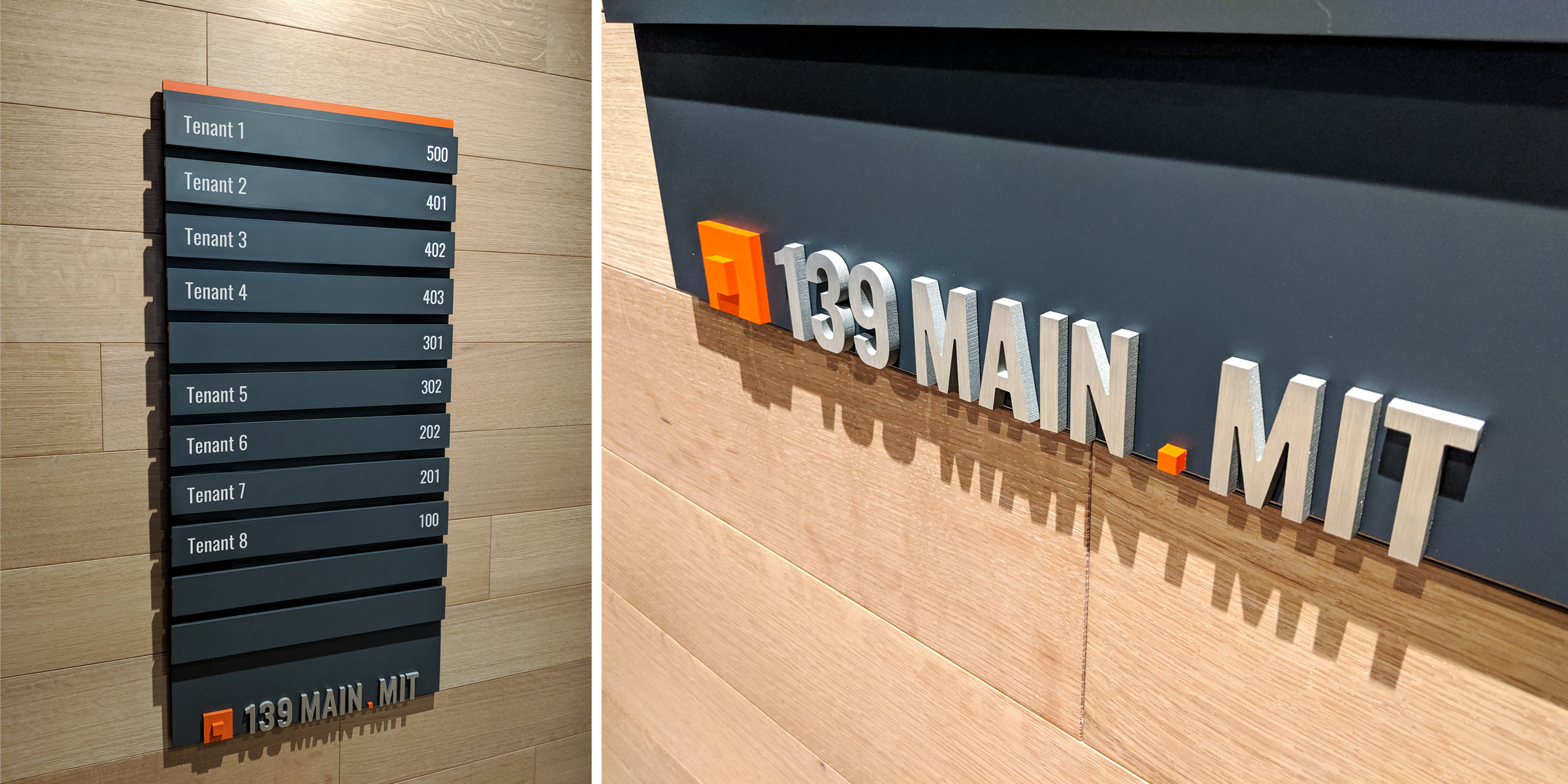
Multi-tenant Office Signage
2019This project is an adaptive reuse, multi-tenant office building. Working as the sole graphic designer, I was responsible for the exterior and interior signage, from concept design and sign location plans, through shop drawings and on site reviews. The signage system consists of building identification, tenant directories, and tenant directionals on each of the upper levels.
The logotype was developed as a combination of the client’s existing branding system and a no to the historical granite letters inset in the brick facade. The condensed typeface also compliments the narrow windows on the front of the building. The orange accent color matches the client’s branding colors and the dark gray coordinates with architectural finishes throughout the space.
The tenant directories and the tenant directional signs were designed with easily removable and replaceable panels to accommodate future tenants. The layering of the panels creates dynamic shadows that play with the existing brick’s rough texture. Signage located behind the security desk was designed with painted faces to match the wall color and bright orange returns for a subtle suprise as visitors pass by. The building identification is cohesive from the outside to the inside without competing with architectural elements in the main lobby.
Completed while working at Arrowstreet.
Tenant names have been shown with placeholder text for privacy.


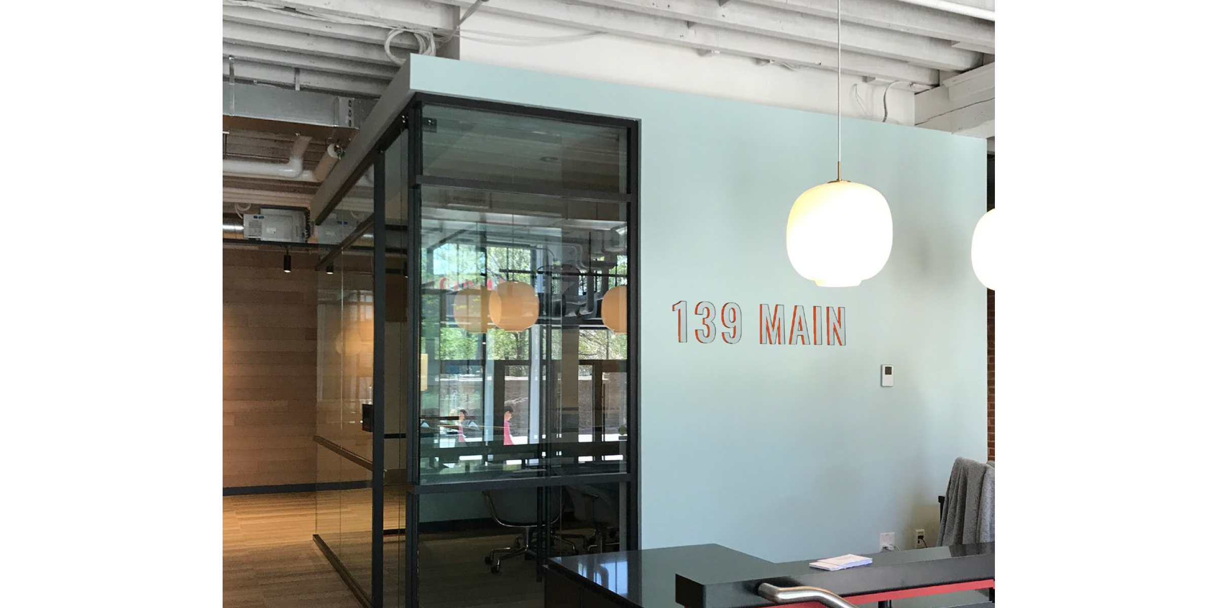 Interior identification image is a rendering for proof of concept. Signage was installed at a later date.